Made for the ModSquad challenge to use patterned paper and also for a friend whose daughter has had twins. I cut out a large heart for the background and then using a Spellbinder die called Layered Happy Birthday, I cut out some balloons from other PP and added them to the heart. Using an unbranded double stitch rectangular die I cut the main panel and added a small scrap of marbled paper on top. I fussy cut two matching little bears from another small piece of PP, after stamping them and colouring in certain parts. I popped them up onto this and added a small fussy cut fairy above. Stamped the sentiment which I also fussy cut out. Added a few small gems here and there. Stamps and card stock all from Gina K. Designs my main go to place for ideas and purchases.
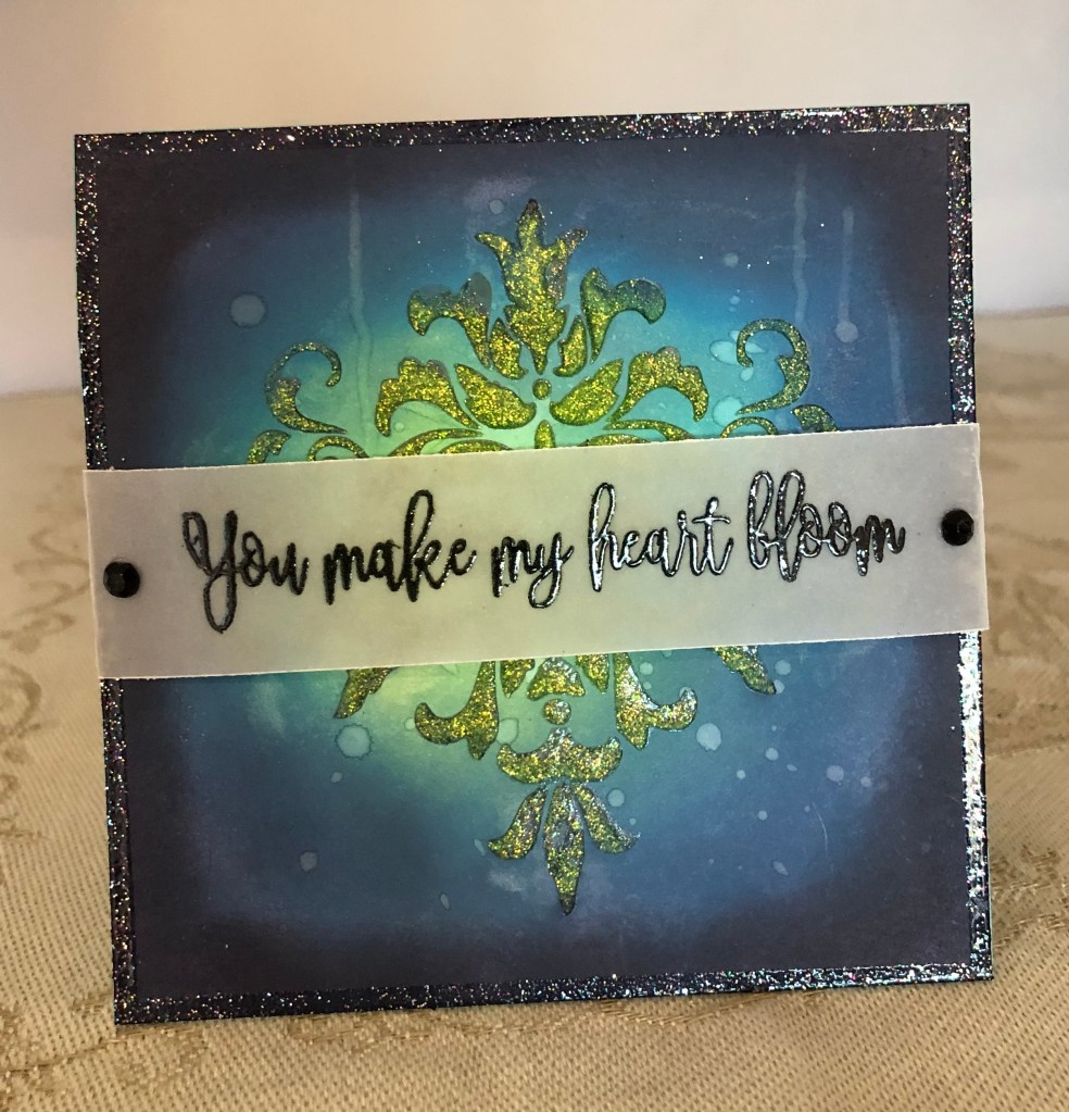
Used another of my gifted stencils to create this one. First brushed colour in circles using distress oxides. Sprinkled a bit of water and let dry. Using Mowed lawn I sponged through stencil to get design. When dry I added nuvo glimmer paste through stencil. I used a versamark pen and ruler to draw a line around edge of card stock and then added an old glitter embossing powder on top. heat embossed to give the shine at edge. Added sentiment to a piece of vellum and heat embossed in black. Two black gems added to each end. added entire piece to turquoise sea card stock.
I’ve been thinking about creating a blog for over a year now and am finally getting around to actually doing it. In order to showcase some of my cards I needed a place to upload them and display them for others to see so here is my first card for the year.
This card has been created for the monthly challenge at Gina K. Designs. We have to showcase a sentiment and cannot use others stamps on the card.
I stenciled Distress Oxides in several pinks using a lovely hand made heart stencil given to me by a great on line friend. I first masked off the area where the sentiment heart is. I stenciled the butterflies using another stencil from the same friend. I stamped the sentiment onto the die cut heart and traced over it with a gelly roll pen to add a bit of sparkle. I popped it up slightly offset over a black heart which I then glued in the masked off space. Added a few tiny bling gems in places. I added main panel to a black piece of card stock and then adhered it to the card front.
The dies I used here are two of the first ones I ever acquired. The butterfly has been used a lot, but the photo frame not so much. I don’t know which brand, but most likely Memory Box or Sizzix. Once I had cut the frames I used a patterned vellum and cut 6 butterflies and attached them together so they were doubled. The body was cut from an inked scrap to which I added some Stickles glitter. I used a sponge and some Tattered Rose and Seedless Preserves ink to add some colour to the frames after which I sprayed with my shimmer spray. Taking a piece of shimmer CS I ran it through using a StampinUp Sequins folder and then I added a little ink to the raised parts before adding it to the note card front. When the frames were dry, I added them on angles and then added the butterflies as you see. The sentiment is from Kokorosa. It is on my desk so being lazy and because I like the font too, I keep using it . I didn’t quite get my placement right with the frames because my hands are sore and I dropped one which of course ended upside down making a mess. It left me with no choice but to cover up the mess. I’m quite pleased with how this one turned out considering the oops.
This card began as an experiment as I tried something just out of curiosity. I knew I wanted flowers in teal and coral but I also wanted shine so I took a scrap piece of silver mirror CS and added alcohol inks in those colours to it. I also tried swiping inks and then adding heat embossing in clear but that was less successful. Anyway I took the Memory Box die called layered Periwinkle and cut the flowers. Spent a few minutes curling the petals before putting them together. While the glue was drying I cut the card base and layers and adhered together. The white layer was run through with an embossing folder that is like bubbles, but it was gifted and didn’t have any labels so I can’t attribute to any company. I die cut two frame circles and added them on top before gluing to the rest. I wasn’t happy with one embossed section so I added a small teal strip to hide what I didn’t like. Then I added the flowers as you see, with the center one being popped up on foam tape, along with a cut apart sentiment from Paper Rose. The flower centres have Trinity Stamp embellishments that pick up the colour they are placed upon. They look a bit like pearls but are not.
I honestly believe this is one of my better creations and I am really happy with how the experiment worked. Thanks for stopping by, I appreciate it very much.
My card will be added to the Color Hues challenge.
Our current MMM challenge #226, chosen by Billie, is to use a Dog/Puppy in the design. As it happens a friend came by to visit and while here asked if I would make her daughter-in-law a get well card. She is suffering in hospital after major back surgery and is missing her dog and her music so my card has both as a theme.
I pulled out an old GKD stamp set along with a dog stamp from Crazy Dogs by Tim Holtz and this card is the result. After stamping the dog I masked him off and stamped the Saxophone which I coloured using a metallic pencil and a bit of gold sparkle pen. My original intention was to stamp the music notes on this same piece but I didn’t check the stamp properly and it was a mess. Instead I die cut the image into a circle and added foam tape behind. The dog was coloured with water colour pencils and some Nuvo Crystal drops were added to his eyes and nose. I edged the circle with a black pen. Directly onto the card front I stamped the music and then added a sentiment from a StampinUp set that was on hand. I curved it slightly on the block so it follows, roughly, the shape of the music. The additional notes are puffy stickers from my stash.
I can’t believe I did this card in 30 minutes while my hubby and friend were discussing some photography frames. She was able to take it with her with the warning that the eyes and nose were not yet dry and to be careful.
Thanks for stopping by, it is appreciated a lot. Have fun with the challenge and I hope to see your creations in our gallery soon.
Strike while the iron is hot is my motto today as I had a couple of ideas in my head and wanted to get them done. If my mojo is working then it felt best to keep going.
The mood board at Double D is all about polka dots and I had different scraps in my file so I pulled them out. Not sure where the papers come from but I think the background one is a StampinUp DSP. The gold strip is something I did a long time ago using gilding flakes and the black strips are just recent scraps. The sentiment is a cut apart from Paper Rose and the embellishments are from Trinity Stamps. I don’t know where the die is from as it was acquired long before I realized that keeping the brand name was a good idea. I did emboss the centre section of the die cut using the die and them popped it back into place as I glued it down. I also added some Pops of Color dots to make a necklace.
This is my last card today. I’ve done 6 so far but some are scheduled for posting on particular dates as they are for my little designing gig. As I have a bit of ironing to do and need a break from my craft room, I shall go and do that before dinner. My hubby is cooking tonight, Yay! Tomorrow we are going to dinner with friends so two nights out of the kitchen, bigger Yay! Earlier this week, I received notice from WordPress that I have 1000 posts. That is 1000 cards and doesn’t include the ones I don’t post. I guess I’ve been quite prolific these past couple of years.
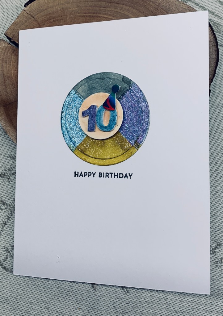
Recently I saw a square card that had been divided into coloured quadrants and I thought I could do the same with a circle. I already had three sizes cut so decided to give it a go using them. I added faint pencil lines and then some masking tape along the lines leaving one section open for colouring and proceeded in this fashion to fill in the colours. I used Sakura pens and Spectrum Noir glitter brushes. The smaller circle was sponged with some Tea Dye ink so it wasn’t glaring white. In my stash I had some foam numbers so I put them on the circle and then coloured them with the pens. The little hat is a die for which I’m searching the set it belongs to. I think it may be an MFT set but I can’t find the right one. As it was on my desk I used it with some of my hubby’s background paper. The sentiment is MFT Itty Bitty Basics.
This is really CAS for me, but I like the end result nevertheless.
Thanks for stopping by. I appreciate all of you more than words can say.
Challenge #225 as chosen by Caz, has the theme of World Bee Day. She will also choose the winners.
When cleaning up and organizing my craft room, I came across a set of pre-printed note cards that I have never truly used. One or two here and there, but the box is still almost full. I liked this design and decided to make my life easy, and use it for my card sample. The CS is slightly rough similar to a linen feel and the pattern continues on the back. I searched for some bee stamps (don’t have many) and found these two tiny ones, as well as the movement spiral, in a GKD set. After test stamping I figured they would work so added them along with the small sentiment stamp, a gift from Kitchen Sink stamps. Using Inktense pencils I coloured in the bees, the rose, and then added water to blend. I also added a sparkle pen to the wings. Initially I thought about colouring in all the flowers, but instead decided to spotlight only one. I used yellow because in the language of flowers yellow denotes friendship.
I’m quite happy with how this ended up and don’t think I could have improved on it even if I had stamped the entire design. Thanks for stopping by, it is appreciated.
My garden is a riot of colours right now and we have two Azaleas next to each other, one flame, and the other bright pink which are truly glorious to view. This die cut piece reminds me of those two plants.
When I was cutting out the fancy Crafters Companion wreath the other day, I couldn’t remember how the 2 piece dies fit together and so I messed up. I liked this half of the mistake so I set it aside and continued with the card I was aiming for. As often happens this piece ended up on a some white CS and I liked it even more so I decided to use it on a card front. It was slightly narrower than the card front so I added it and then cut the excess card front off. With another small scrap piece of the same photo/PP I die cut the butterfly. The dots are pops of color from Scrapbook.com. I couldn’t figure out which sentiment or how I wanted a sentiment to look so I set the card aside for a while. Coming back to it, I decided to pull out some sentiment stamps and play around but they wouldn’t curve the way I wanted. Then I thought about cutting up the longer sentiment, from GKD and adding them as you see . They look erratic which is how a butterfly flies. I liked this so glued them after adding a bit of sparkle with a gelly roll pen. I also added a bit of sparkle to the flower centres and the butterfly body.
It is such fun to use my hubby’s photo in this manner and I just love the colours. I am entering the card into the Fourseasons challenge. Thanks for stopping by, I appreciate it a lot.
When I saw the colours at Sunday Stamps, they reminded me of a card I’d seen a while back that I wanted to try. I did save it on my computer but forgot to attribute it so I’m not sure whose design I’ve CASE’d. I really liked the simplicity in the design yet it has lots going on at the same time. Because I’ve also used a stencil it fits into the stencil fun challenge too, and I guess that flowers are more girly so the twist is also covered.
My stencil is a handmade one that was gifted to me a few years ago. The flowers are from Memory Box, sentiment strip is Paper Rose and the embellishments are YNS. I inked throught the stencil using 2 greens so it looks similar to the green in the photo and I brushed the flowers using two pinks and ayellow for the centre. Using a Hero Arts infinity set I cut the circle frames and added them as you see. I edged the panel with a Spectrum Noir marker to give slightly more impact.
I’m really happy with how this one turned out. Thanks for stopping by, I appreciate you, your time and your comments.
At first, I really wasn’t sure what I wanted to do for this challenge so I checked out a few different posts to give myself some ideas. I saw one idea using a frame that I quite liked so in a way I’ve CASE’d it with this card. Mine is, however, quite different because I didn’t have the same style of frame so using what I have became the mantra.
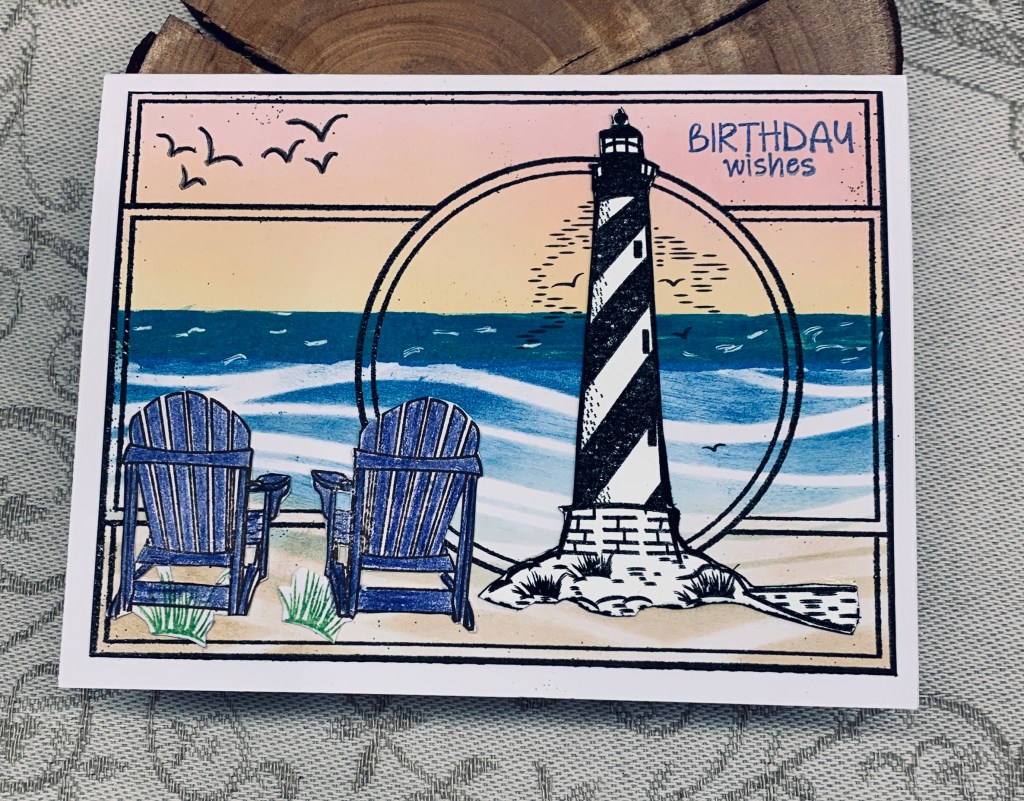
The stamps used are from a couple of older sets, the frame from GKD, the rest mainly from Inspired by Stamping, and the sentiment is from Kokorosa. I started by inking the the background and for this I used a wave stencil and distress oxides. I masked off the horizon line so I could sponge the sky and then promptly messed it up after I had removed the mask. These days I don’t get so fazed over a mistake and to fix it I added a second horizon line and made a wash of darker colour to cover the mistake. I quite like the cover up. The beach chairs were stamped, pencil coloured and fussy cut as was the lighthouse. Then I took the frame stamp and stamped it in Black Soot, added black embossing and heat set. Even though I had carefully dried the inks and used an anti static quite liberally I still have specks here and there. I decided to embrace them instead of fretting. I realized that fussy cutting the lighthouse with the little lines and birds wasn’t possible, so I figured out the position and stamped it directly onto the panel before adding the cut piece over the top. I added a few white lines on the darker section of the ocean so it looks more like waves, cut the panel down to the correct size and added it to the card front.
We tried to stay awake the other night, so we could see the Aurora Borealis but simply couldn’t do it. For night owls like our friends it is doable, but we are up so early in the morning that staying awake after 9pm is almost impossible. They got some great photos and seeing it in person remains on my bucket list. I’m sharing 3 of their photos here.
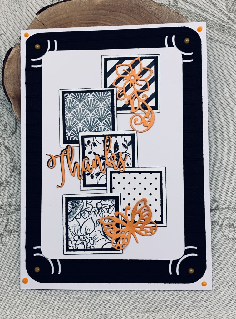
The recipe challenges at As You See It, always leave lots of scope for creativity and with this card, I think I can safely say my mojo is back. That said, I almost ruined things because I forgot the embossing part of the recipe which meant more creative thinking to find a work around. In the end I cut the focal panel down to a smaller size and built the background around it giving me a 5X7 card when finished.
I used a couple of punches and some scrap PP to do the inchies. Papers are from GKD and StampinUp. I backed them with a black layer and then a white one using a pen on the edge of the white squares so they would stand out more. After gluing them to the white layer I added the pops of orange die cuts. All from a Gemini Crafters Companion set. I cut one black sentiment and one orange so I could offset the word slightly for more impact.
The challenge here is that the photo doesn’t show the embossing on the black piece so the DT’s are going to have to take my word for the fact that it is there. I used a StampinUp/Sizzix folder called Simple Stripes with the lines going on the horizontal instead of vertical. Black doesn’t photograph well and in retrospect I should have probably gone over the lines with some white ink. My hands didn’t like the punches at all and when I tried to round the corners of the black piece it looked messy so I chose another punch that also added the curved cut outs you see. This cleaned up the edges a lot. Initially I thought about rounding the corners on the note card, but decided against it, mainly because my hands weren’t going to allow it. Instead I added some Nuvo drops in orange and found it interesting how the colour changes when they are added to black. The photo also makes the 2nd to top inchie look gray, but in reality it is very black.
I like the card and am happy that my mojo is back as it has been a somewhat challenging week. The arthritis has been a real nuisance and my left hand thumb went into spasm several times which was excruciating. It happened while at the physiotherapist and she was shocked to see what happened. In a way I’m glad she saw it, as it is hard to describe. It took her 10 minutes to get it to unlock and stay that way and I’m quietly trying not to freak out at the same time. Thankfully, things have settled a bit, although I am being extremely careful with my hands.